Inspiration and Ref

Continuing to adjust and make improvements, but this time in motion!

Here's my most recent iteration of things in motion, using animation states from my most recent Style Sheet. From here on, I'm going to continue to add to things while going back and adding more whiz bang effects and animations on top of older elements.

Things I'm noticing now that will be addressed in the next animatic -- not enough attention is being drawn to the Talents section when the "Psych" tab is clicked. The shiny glow I have going on in that divider is just not noticeable in my peripheral vision. It should be more noticeable to draw my attention away to the other side of the screen to show me what I should be looking at. Also, the timing of the transitions between selected and not selected on the "Resources/Support/Psych" tabs is clunky and slow. I need to speed that up.

The rest of this post is going to be going into how I got to what is being shown in the animation.

Style Sheet

This is my most recent Style Sheet, which I'm using as a guide for the different animation states shown in the mockup.
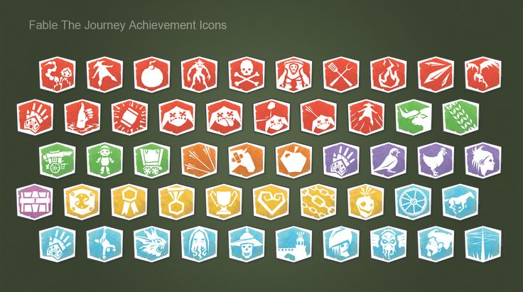
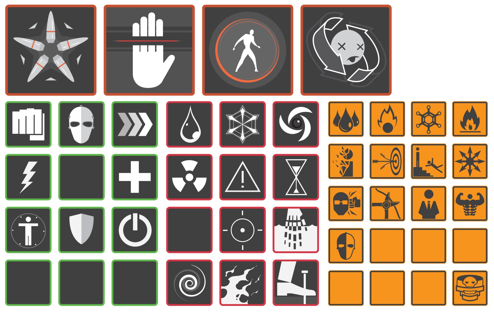
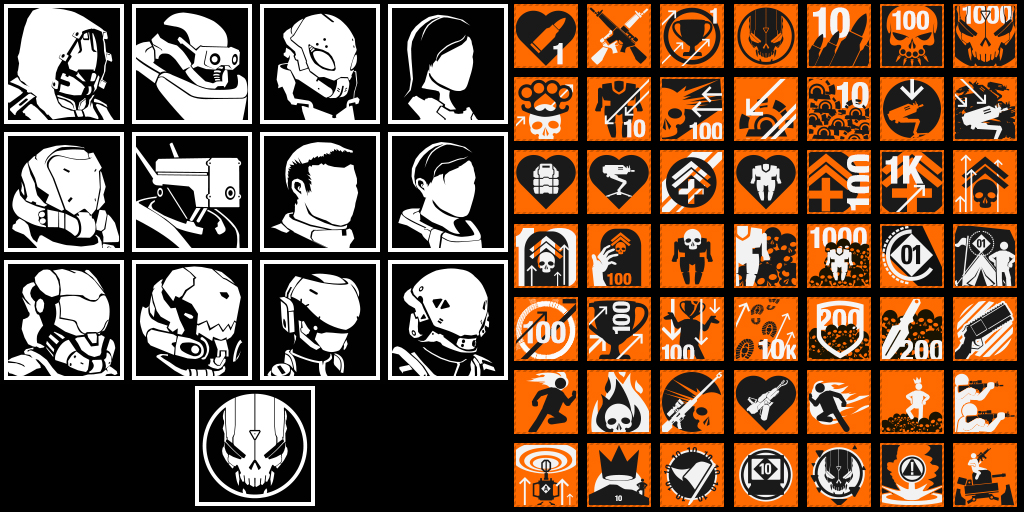
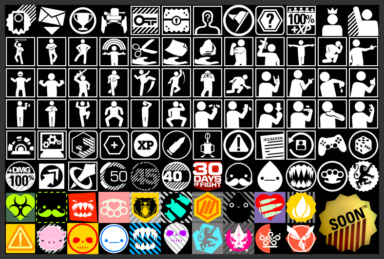
We have Icons!

Here are some more finalized versions of research icons based off of the sketches that were shown in the previous blog entry. I like the flatness of what's going on, but personally they're still a little muddy, and I'm considering bringing in a second color to help add more visual flair. As icons, some are still a little iffy on what they're trying to convey. "Stockpile Energy" is super on the nose and I need to make a version that sits better in that space. "Relocate Headquarters" should feel more like a fort, and less like a Rook in chess.

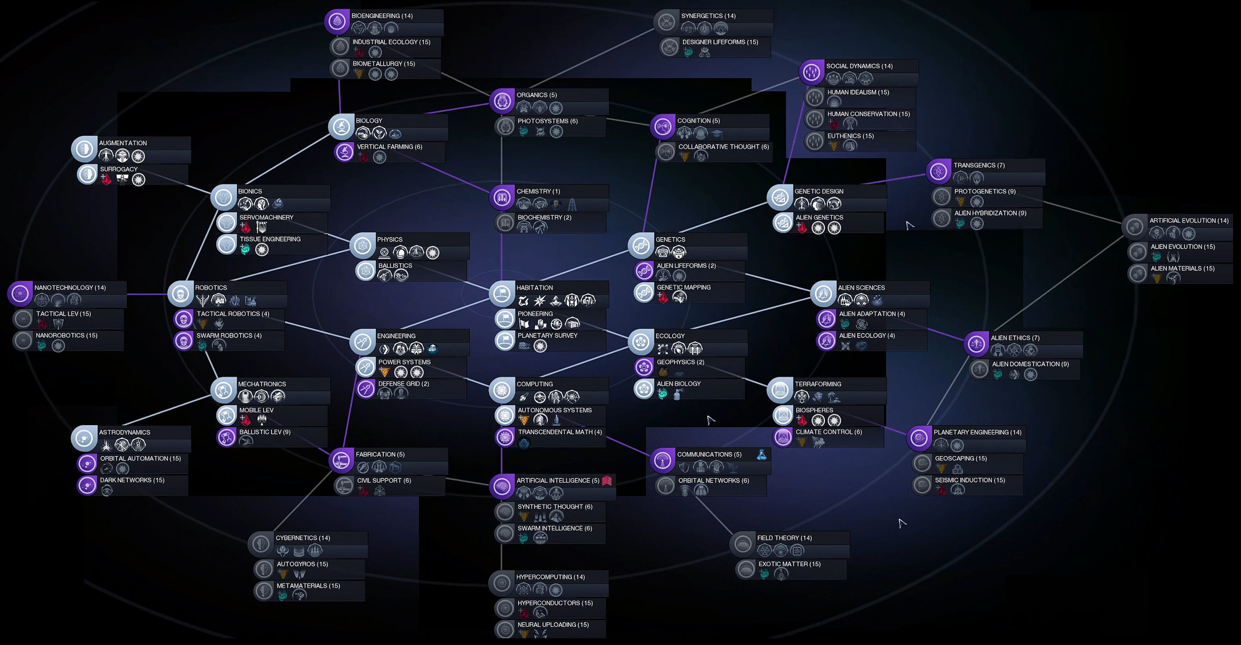
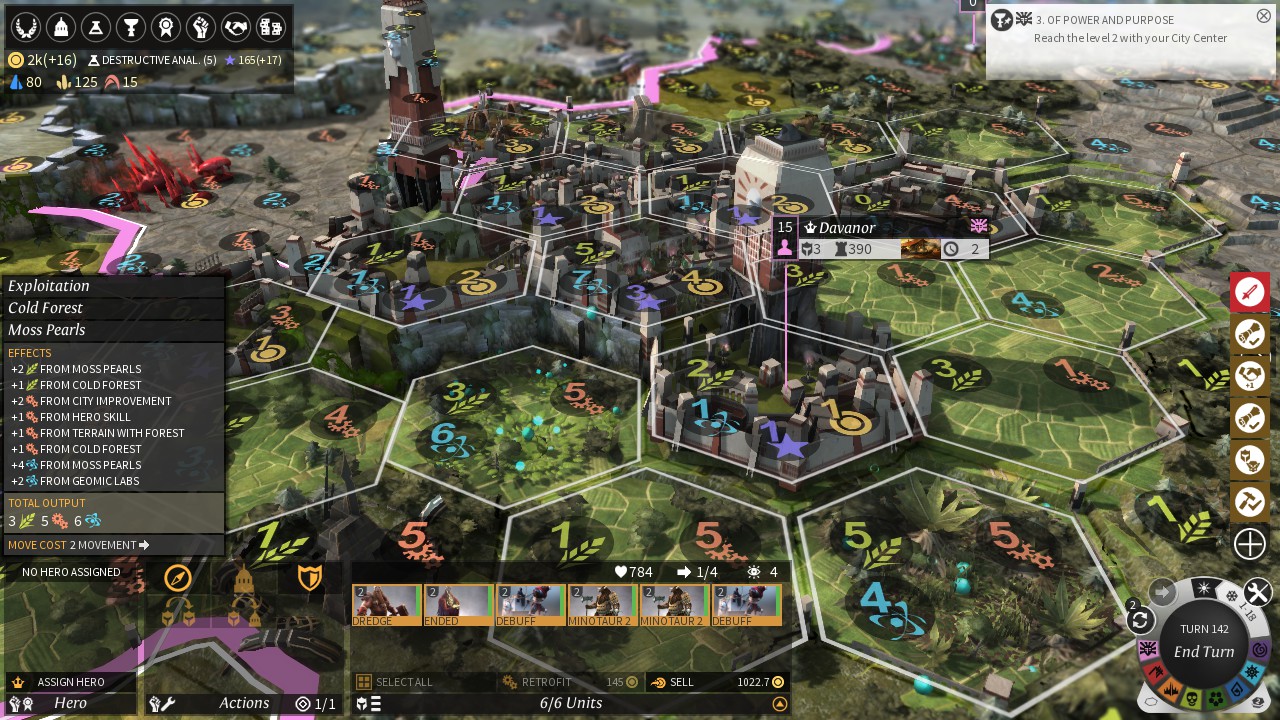
This version of the research screen isn't the one that was used in my animated mockup. I actually went back into this and scaled things down to give more breathing room so that the player will be able to parse this literal wall of information that they're seeing.


With Top Bar

No Top Bar

Here are two versions of the iteration that made it into the animated mockup. The only thing different is that I'm deciding whether or not to include the top bar, as that has information that could affect the player's decisions on what to research. I just liked the open space above the city name.

In the next pass I'm going to add more to the information happening on the top bar, which will make it more vital towards gameplay. I like how another 4X game like Endless Legend and Endless Space manage to go without using the top bar for information, and I think that Civilization: Beyond Earth might have too many different icons on its top bar -- I think I'd just like to find a balance between providing useful information to the player and providing too much information without context to the player.

Endless Legend

Endless Space

Civilization:Beyond Earth

Iterations, Tweaks, Thought Process and Inspiration

I've spent the past two weeks iterating and making even more tweaks on the styles that I've already developed so far.

Style Sheet 2v2

Style Sheet 2v2

In this style sheet, I was iterating a little further on the previous one, attempting to add some more character to everything, making things seem a little less clean/flat/perfect. It was in this stage that I also experimented with how some of the button states would move when they're interacted with.

Feedback at this stage was to shrink the frames of the boxes, because they're getting too big and don't feel modern anymore. Same goes for the massive mouse cursor which was my bad for not sizing correctly when I imported it to After Effects.

Other notes are
-- 1) that the difference between the different states (unselected, mouse over, and clicked) is too small to be noticeable so I need to make that more apparent in the next pass
-- 2) the glows in the unit boxes under "Forces Supported" are too noticeable for unselected, those need to be taken back
-- 3) make the more important buttons different colors, like with what I have going on in the "nerve staple" button
-- 4) consider a background design for the interiors of the HUD boxes (the grid overlay I have on them currently wasn't noticed so I need to bump that up and maybe incorporate something else
-- 5) the typeface selection is improving, but everything everywhere is all caps and it's making the interface stand out too much, so I need to reign it in


Style Sheet 3

Style Sheet 3

Layout Pass 3v3

Layout Pass 3v3

So I've gone back in and applied most of the feedback from the previous round i.e. slimmer frames on the HUD, less CAPSLOCK text, and attempting to draw the eye to the important areas with more distinguishable button states/colors/text color. I'm going to see how I like having black text as selected text as a way to distinguish more from the normal light text on dark backdrop.

And now for something new. I've been waiting to post here until I had a little bit more refined iterations, but I figure it's my blog...so I'm going to start showing some sketches and places that I'm drawing inspiration from.

Icon Sketches

Icon Sketches

Here are some first pass sketches at some ideas I have knocking around for icons on the tech tree that the player can research in this game. It was an experiment to see whether or not this hologram-esque look I had in my head is feasable, and the answer is...it's not. At least in this iteration. Things look too mushy, and are losing their iconic-ness because of how mushy all of the glows are starting to make them look. So I think that a direction I'm going to push these in for a more refined pass is a one or two color flat icon with no glows.


Here'es some more experiments I'm doing with making the HUD backdrop feel more lived in with some textures. (textures found here -- http://elyssafawn.deviantart.com/art/Screen-Mode-Texture-Pack-546039287 )


Inspiration for the directions that I'm going to continue to take the icons in --


Other games I'm looking at for inspiration from their UI both aesethetics and how they function-- 

Endless Legend

Endless Legend

No Way Out -- https://www.artstation.com/artwork/no-way-out-ui-design

No Way Out -- https://www.artstation.com/artwork/no-way-out-ui-design

Civilization 5

Civilization 5

Civilization Beyond Earth

Civilization Beyond Earth